Sapporo "Refined by Rebellion" campaign
Overview
As a company which can trace its origins back to establishing our first paper mill along the banks of the Yarra River at Southbank in 1868, Opal understands the importance of heritage. So when Sapporo, Japan’s first beer company founded in 1876, entrusted Coopers to collaborate with us for their latest campaign, the iconic brand knew it was in safe hands.
Opportunity
 Sapporo was looking for packaging which demonstrated originality and creativity in structure and design, linking the consumer to the heritage and story of the historic brand.
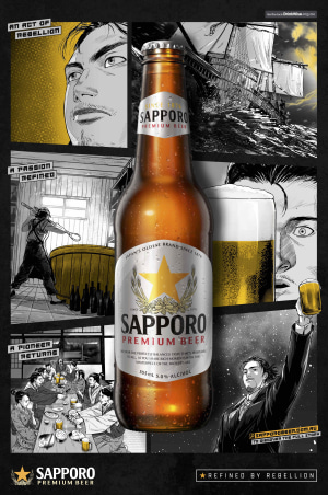
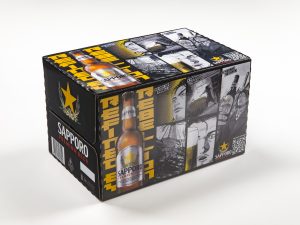
Understanding the importance Sapporo placed on brand and identity, Opal’s print capabilities aligned to support Sapporo’s rich history. The design incorporated culturally significant and eye-catching Japanese iconography in the form of Manga artwork on the carton itself—the first time Manga has been used on a beer carton.
Manga is a Japanese illustration style with strong cultural significance dating back to the 12th century. It is considered a genuine artform and has long been a rebellious method of storytelling, giving voices to the fringe and telling tales that mainstream media couldn’t. Which is a fitting match for the chronicle of Seibei Nakagawa—Sapporo’s first brew-master—transforming the story to legend.
Execution
Melding the use of this culturally significant artform together with Opal’s robust packaging process, we implemented the latest generation in single-pass high speed digital inkjet printing to capture and immortalise the story for consumers with spectacular clarity and colour management. The QR code incorporated into the design rewards curious consumers by taking them to the full story hosted on Sapporo’s website which contains eye-catching art and animation.
Outcome
Made with recycled content, the kerbside recyclable solution blended sustainability with engaging and attractive design. Opal’s packaging exceeded customer expectations, with consumers actively seeking out the collectable limited-edition box.
